Moodboard: Weylandts Styling

Weylandt's Lounge Styling.jpg
Pieces sourced from Weylandts. Moodboard created by me on Olioboard.

On Friday I went into the Weylandts store in Fourways. I was there specifically to look at their merchandising and also to see some of their new pieces. I had not been there for over 6 months since my mom was furnishing her apartment. As the Kramerville store is far more convenient for us, that’s the one we frequent. It was lovely to be there appreciating their styling from a different location. The stores are very similar and it’s clear that they belong to the same brand. A brand that seems dedicated to continuity, clarity and flow. Weylandts is one of the big design brands that manages to sell its clients a lifestyle and convinces them that a home cannot do with just one piece of their furniture, but thrives off another, even if it can stand on its own. I hope that makes sense…

Weylandts began as a traditional furniture manufacturer in Windhoek Namibia, in 1964. Today the store has eight retail showrooms in South Africa and one in Melbourne, Australia.

The Weylandts aesthetic, initiated by Edgar Weylandt then later refined and curated by his son Chris Weylandt, marries Scandinavian design-mindedness with an African heartbeat. (Weylandts, About)

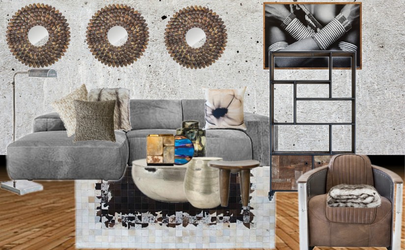
I’ve put some of my favourites in a mood board and styled them, what do you think?

Shop the look, from right:

Tom Cat Chair, found here

Pure Bookcase, found here

Hammer Jewellery Wall Art, found here

Marconi Daybed (sofa, in grey), found here

Ball Coffee Table, found here

Egg Stool, found here

Wooden Stool, cannot find item online

Leaf Mirror, found here

Floor Lamp in Antique Silver, found here


Hope you all have a lovely week ahead.

:)x B

#WeylandtsStyling

I’m in a (Greenery) Mood.

pantone-color-of-the-year-2017-greenery-15-0343-leaves-2732x2048-1200x900
2017 Pantone Colour of the Year: Greenery

Every single year since 2000, the Pantone Institute has declared a particular colour the “Colour of the Year”. It provides a guide to fashion designers, interior designers, florists, wedding stylists  and other consumer-oriented design fields for their designs and future products. The Pantone Colour of the Year for 2017 has been announced as Greenery. Greenery is meant to represent refreshment, rejuvenation and rebirth according to Leatrice Eiseman, the executive director of the Pantone Color Institute.

I love a good colour and as someone who loves gardens especially patio gardens (it’s becoming an obsession, one which I am of course keen to share) I will most certainly be considering and including more of this shade in my Interior Styling projects as well as on the Furniture and Homeware I design and curate for my clients. It would also be lovely to find ways to incorporate this fuel of green energy into Events Styling as well. It’s a perfect stamp of cement on the Events industry as well because in the last few years we have seen a move towards the use of natural centre pieces consisting of succulents, tree stumps and forestry.

In the meantime, I’ve created a Greenery moodboard on Olioboard to inspire you to look for ways to add some rejuvenation into your spaces without them feeling as if a green monster is eating your life.

ob-bbd-greenery-moodboard
Greenery Mood Board by Buyi Joy Dlamini

I’ve added accents of gold and pink to the green pieces as well as kept taupe the undercurrent of my theme to create an environment that showcases and holds the bright colours in the space. I’ve also been fascinated by the variety of pendant light designs on the market and decided to include a set in my mood board. What grabs me immediately about this mood board is the skull wallpaper. It does add a slightly eery feel to the space, but if you can overlook that, it is accompanied by a lot of character.

Until next week,

Buyi :)x